mc.roleplayhub.com
players online
You are using an out of date browser. It may not display this or other websites correctly.
You should upgrade or use an alternative browser.
You should upgrade or use an alternative browser.
for the love of god how do i tailor..
- Thread starter dennisthemenance
- Start date
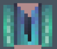
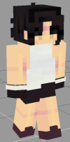
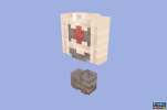
It looks off to me, somewhat. Could be the shading but I’m also new to making clothes </3
dennisthemenance
Level 73
AirconUnit
Level 106
Remember this. There is no right or wrong way to tailor, The whole point is that you have your own style and how you do things. Id just experiment until you find something you somewhat like then slowly develop it over timeI'm trying that. This is the best I've gotten so far!
I didn't make the base though, I only made the outfit. I'd like to say I'm improving bit by bit perhaps?
View attachment 54226
Here's a tip: severely limit your pallets
Don't use 15 tones of green, have 7 and use the first one or two colours as highlight colours.
Imagine you're layering your work, its
Like water colour, start with your base colour (usually second colour or third colour depending on how many highlights) then build up each layer of darkness.
It's much better to make your own colours for a more unified look to them all.

But explaining that is a whole new conversation, if you want to quickly create very simple hue shifted colour pallets, you can input your highlight colour into this website and mess with its darkness, hue and saturation values to create arrays of pallets for use.
When hue shifting keep in mind that the colour should always shift into its darker counter part:
Etc, bare in mind these are very soft rules and depend on your shading style (these are based off my own shading)
How you shape your shading is up to you.
Don't use 15 tones of green, have 7 and use the first one or two colours as highlight colours.
Imagine you're layering your work, its
Like water colour, start with your base colour (usually second colour or third colour depending on how many highlights) then build up each layer of darkness.
It's much better to make your own colours for a more unified look to them all.

But explaining that is a whole new conversation, if you want to quickly create very simple hue shifted colour pallets, you can input your highlight colour into this website and mess with its darkness, hue and saturation values to create arrays of pallets for use.
When hue shifting keep in mind that the colour should always shift into its darker counter part:
Red | Purple | |
Blue | Purple | |
Green | Blue | |
Purple | Blackish blue | |
White | Yellow or blue |
Etc, bare in mind these are very soft rules and depend on your shading style (these are based off my own shading)
How you shape your shading is up to you.

Attachments
Last edited:
Users who are viewing this thread
Total: 1 (members: 0, guests: 1)
