Guide | How to Choose Colors
A guide by Zrle
American spelling bc . . well I’m american! Anyways. COLORS! Picking them well can be hard, even at times I struggle to pick colors, but I work independently of a palette. So this is my guide to picking the exact colors I use. Keep in mind, everyone has different opinions of what looks good and what doesn’t! So this is just my general rule of thumb.
Shoutout to 2500, my captain, who was the one who wanted this guide the most.
Also, this is just a general guide for color theory too. So this can be used for other applications as well.
For starters, I ALWAYS recommend a reference image when creating a skin. The easiest way to begin is by just choosing a baseline color that fits the same color as the reference, but choosing what specific tone of the color varies. For this I use PMC! So you can check out my guide for how to use it if you need help learning the program.
Table of Contents
1. Skin Tones & Colors
2. Creating a Good Color Scheme
3. Fixing a Color Scheme Easily
3a. Working with a Desaturated Palette
3b. Adjusting with a Common Color
3c. Using Minimal Bright Colors
4. Shading
4a. Blue
4b. Dark Pink
4c. Red-Orange
4d. White
4e. Black
5. Final Palettes
Let’s look at some skin tones, with the hardest color to make work for everyone, white. In tailoring, no one ever uses straight up white. It’s always a yellow, red, or grayish tint.

Looking on the left side, that’s roughly where you will be on the color wheel. Anyways, I selected tints, and placed them on top of skin tones you would use. Notice how they each have different colors that work?
Let’s discuss why!


The next thing to consider when picking colors, is the contrast that they offer.
 Two color palettes, the one on the left looks like it could be good, but then if you make it grayscale, it barely has any contrast. Super boring visually when put on a skin, and can cause agida. If we change up the values of the colors, we can create a lot more visual interest on the right.
Also, keep in mind, your eyes probably drew to the right side first? Again, contrast creates visual appeal.
Though, most people will not be choosing multiple colors for any skins. Often, you will have 1-2 bright colors, and everything else will be dull colors, or black and white. However, even between that you have to pick the right shades.
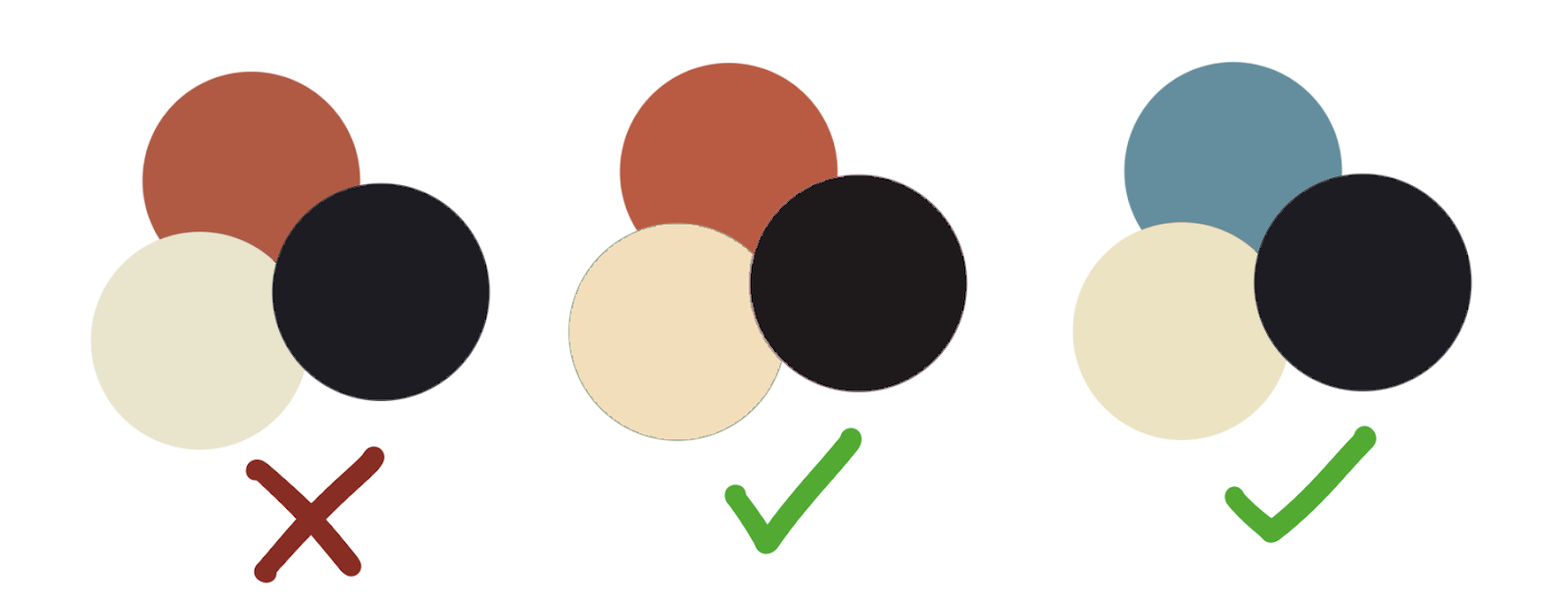
The one on the left doesn’t work. Why? That “white” looks just lifeless and green. That black, also just doesn’t look right. - Because it’s a blue toned black.
To keep the red, we have to change both the black and the white. So for the middle I picked a more vibrant white, and a purple toned black. This looks a lot better together! However because it is really vibrant, if we think back to the skin tone examples, this would not look good against a pale or desaturated base. Choosing a black that is desaturated makes it work for a lot more bases, so I always keep blacks very desaturated!
Let’s look at these one by one!

If you can't see the problems with the contrast, let's turn it gray.
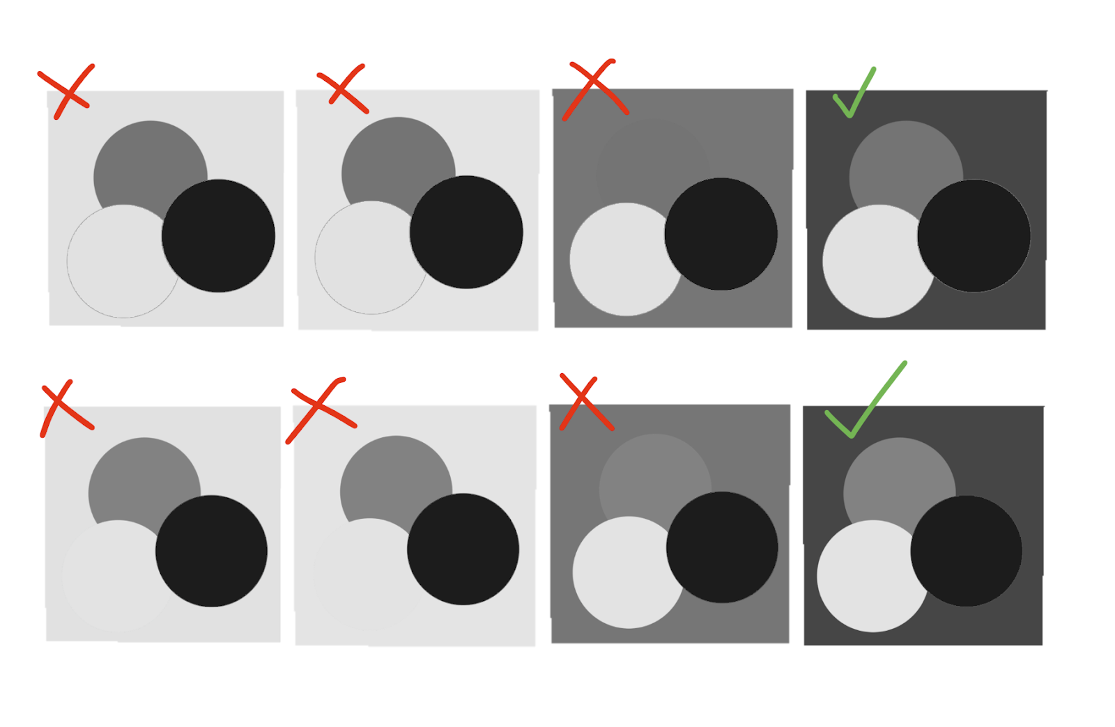 Wow. Those colors are all terrible for contrast.
Let's move onto section two. How to pick GOOD COLORS!
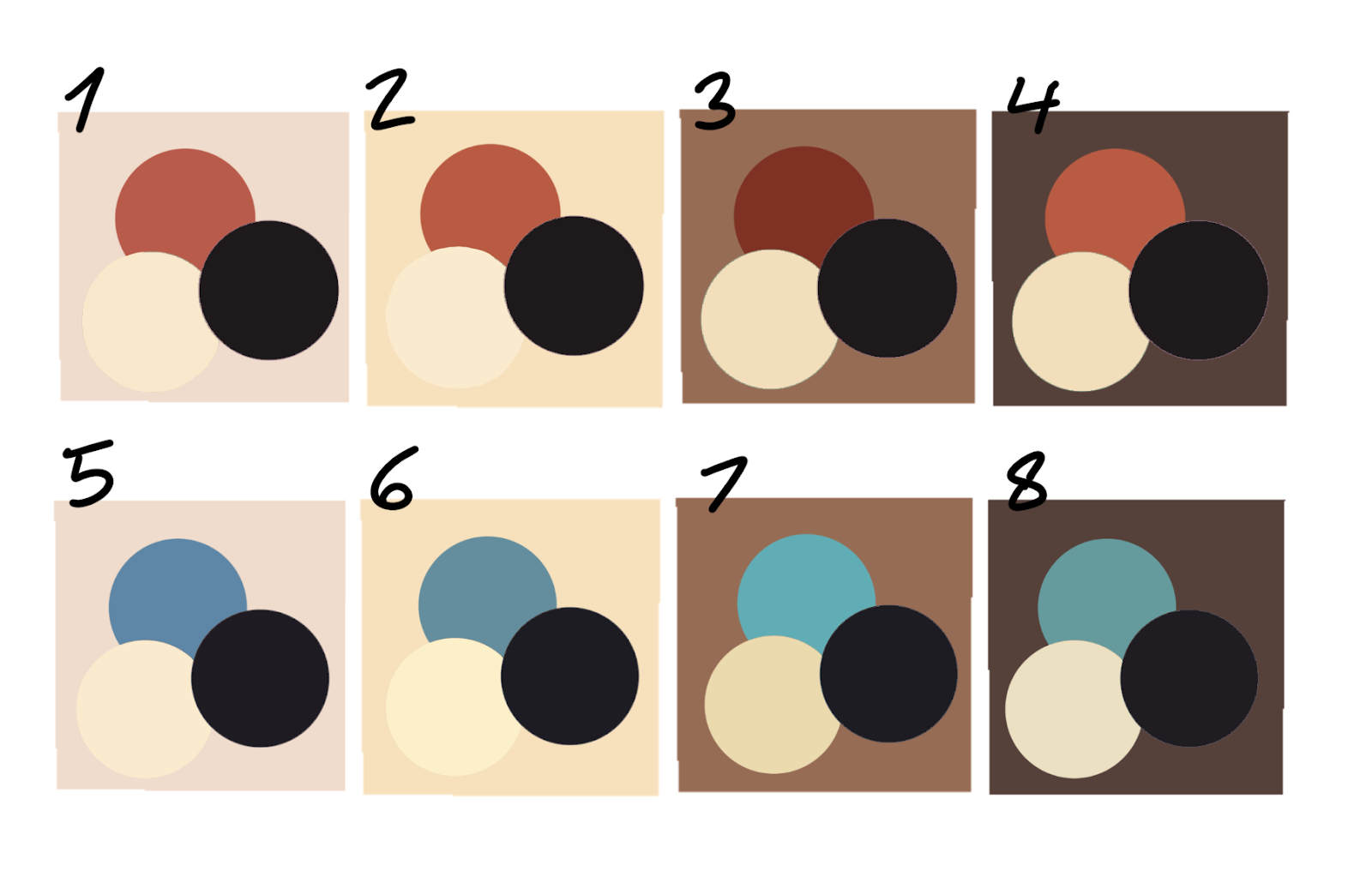
So I will talk about blue black, vs red black vs purple black. Why not use orange black as it will work better with the skin tones? That’s just dark brown. It will NOT look black.
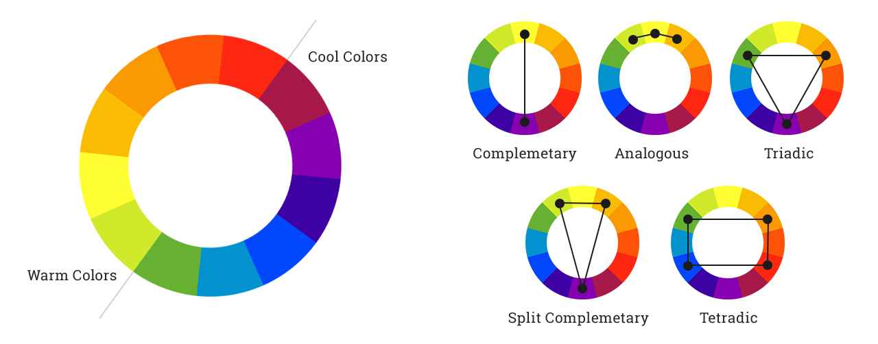
This is how we begin. You choose color themes that fit. If they are one of these color scheme ideas, then that will work well together.
Cool colors will automatically look good together, and warm colors will look good together. Try to not mix them.
When creating a fit, try to balance the colors out together.

 Let's take a look at a really basic outfit. Black and white. You want to keep the contrast balanced for good intrigue. Which do you think looks better?
If you picked the left one, I would agree. There is better contrast, and it brings it all together, the elements of the same color are separated. Both black and white are evenly balanced as well, each one has a large element and a smaller accent element.
You can also add color, and still keep this balance.


If we look at these two images, of course, personal preference exists . . but the one on the right just feels better compositionally! The white is brought back, which allows for repeat elements that make the outfit feel unified. The blue of the jeans is different from the blue of the bag, but it all looks good together.


We can also change the color of the bag! Looking at this, both of the first two would look okay! The last one . . not so much.
Why is that?
Well the orange adds a complementary scheme to it, we have blue in the denim, and the brown of the skin tone and the bag fit nicely together. The blue works well like I mentioned in the other one, as it is more of a monochromatic scheme with the bag.
The green really has no color scheme. You could argue that it is an ****ogous color scheme, however it covers a whole half of the color wheel, from orange to blue, and only has 4 colors. So you would need more colors between it to tie it together, which . . would make a skin look messy because of that broad range.
The best advice I can give for making good skins (in terms of color), is just make it purposeful. By purposeful, I don’t mean “I'm gonna choose green because I like green.” In that way, it’s not actually mindful of what you’re doing. It’s absent minded choosing colors. Instead, I mean “I’m gonna choose red, yellow, and blue as that creates a triadic color scheme of the primaries.”
Let's say everything I just said went over your head, and you still don’t know how to pick specific shades of colors! It is 100% a mindset that you have to practice, and learn. However, here’s a couple easy ways you can balance colors to work well.
These methods however, aren’t as good as just editing the colors individually.
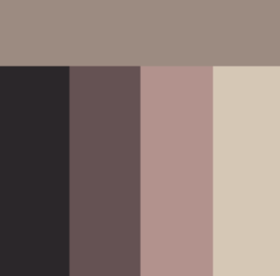 That is a palette that ranges from yellow to purple. All of the colors chosen are very desaturated though, this works if your skin is naturally desaturated.
For this method, just take any colors, and just desaturate them with your saturation slider!!
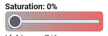
It’s worth noting, that the saturation percent, depends on where it is in terms of value.
 The most vibrant point is when it is neither a tint (white combined with color) or shade (black with color). Which means, it is brightest in the center between those points. A second note to add is that black is perceived as bolder than white in nearly all cases. Of course, if a character has a dark skin tone, that breaks the contrast that black usually holds, and then white becomes more bold.
Also, black looks better when desaturated in my opinion. . It’s easier to look good on multiple skins. If it is vibrant, it can easily just look like a dark color of whatever hue you are using!
So let's look at the saturation for each color of the desaturated palette!
 16%
16%
 33%
33%
 26%
26%
 13%
13%
 9%
9%
 Let’s say this is the colors you want to use in your color scheme, obviously, they don’t work super well together.
If we take the skin tone with “D” then place it with color with “B”

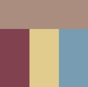 It is desaturated a bit, however this color scheme will work a whole lot better and it keeps the colors that were originally wanted. Then you can individually up the saturation of colors. . And it will still work well with the skin tone.
 Like this! It’s a small variation from the first but it just adds an element of unity.
Additionally, if you have a brighter skin tone, this method also still works!
Just match colors that will work well with the skin tone

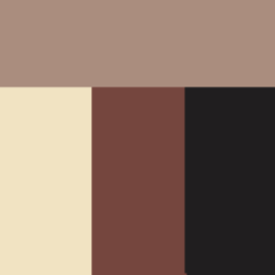
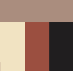
So picking a black and white, and then playing around with colors that you like that work well with it. Of course, try to keep consistency if you are using cool toned vs warmed toned colors.
These are the color examples I will use:
The long bar is the base color, then the dark color on the side is the shadow color. You want to choose something that has relatively the same amount of contrast on each color. For choosing a shadow, they are always darker, slightly more desaturated, and way cooler toned. So slide the hue all the way to a more blue/purple tone, and make it slightly darker and more desaturated.
White is the one exception, and that's because it is a yellow color. To make it appear cool toned, sliding it into a red tone will just make it look yellow / orange-ish and not a proper good white tone. So in order to counter this, you will have to desaturate it a lot more.
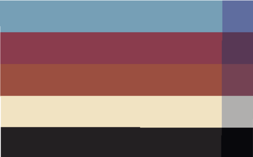
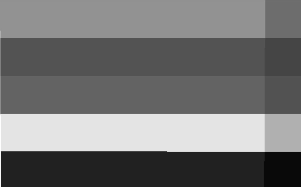
Example image of contrast in black and white

How I choose this is I slide the hue all the way down towards blue, creating that nice depth. Then I move it slightly more desaturated and darker. The hue change will do most of the work, so you don’t really have to edit the value/lightness and saturation much!
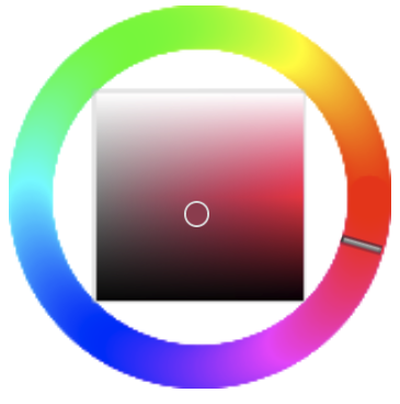
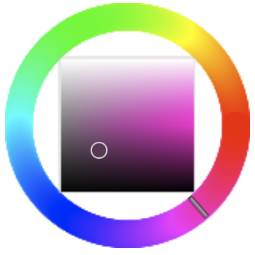
With red, you make the shadow a deeper purple. This I desaturated more, as red is a very bright color naturally, so it gets more desaturated than other colors.
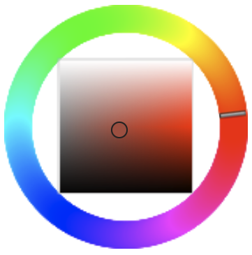
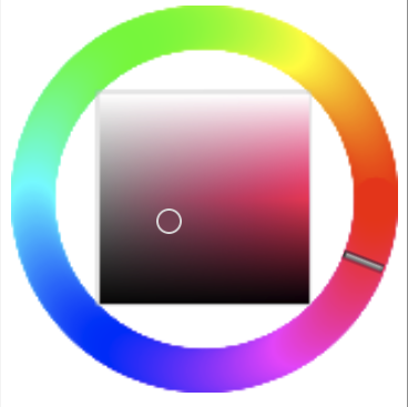 With the red orange, I bring it more towards a red-purple. Again, similarly I desaturate more than I make darker. The value can remain relatively similar.
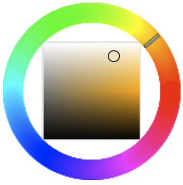
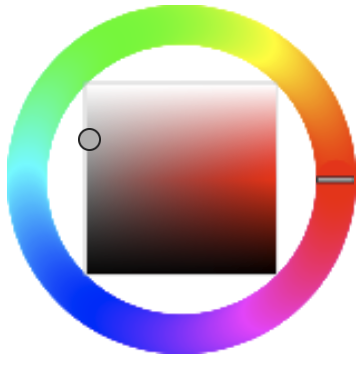 White is the one exception pretty much. So I just make it slightly darker. I make it more red, and DESATURATE NEARLY ALL THE WAY TO GRAY. Given color theory, a gray will look blue against yellow. So to create rich shadows within yellow/white, making it go more gray is the way to do it. Since it is all the way on the opposite of the coolest / biggest shadow color.
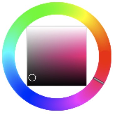
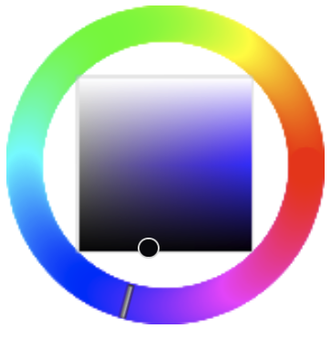
For black, it really depends on how you want the color to look. Since monitors typically don’t make black look good, the shadow color you just mess around with a bit. So make it a bit darker, and more towards blue. Obviously for blue toned blacks, you just make it richer or more of a vibrant deep blue.
The next step I do is lower the opacity of the shadow color, to around 20~ percent, and add it over the base color to create my palette / shading for that skin.
So that’s what this produces!
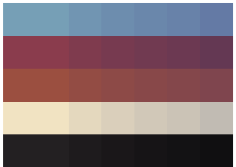
With the darkest shadow color, I sometimes have to double up on the color twice to make it a proper dark color.
Then when creating the highlight colors, I just crank up the saturation. For red or black colors, you have to make the value lighter by 1-5% otherwise it looks darker and more saturated.
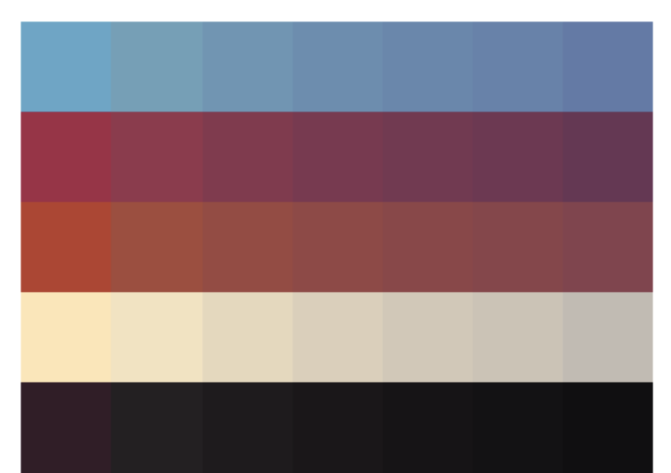
If it is too saturated, just grab the base color and lower the opacity and go over it until it’s just a bit more saturated.
Then that is how I make palettes and colors easily.
I will not be going over how to place colors, as I do that in other guides. So check them out!
Thank you for following my guide!
If you have any recommendations of things I should further explain, please let me know!
I took a lot of inspiration for formatting from Bheom’s guide! If you want to learn how to use PMC, make outfits, or understand how to pick colors. Check out my other guides:
How to Use PMC - https://schoolrp.net/threads/guide-how-to-use-pmc.78983/#post-275091
How to Make a Base - https://schoolrp.net/threads/guide-how-to-make-a-base.78984/
How to Make Outfits - https://schoolrp.net/threads/guide-how-to-make-outfits.78985/
Or check out one of these lovely other guides:
Bheom’s Somewhat Helpful Guide to Tailoring
https://schoolrp.net/threads/tailoring-a-somewhat-helpful-guide-to-tailoring.70855/
C3rt1fied’s Tailoring Tools and Information
https://schoolrp.net/threads/☆-srp-☆tailoring-tools-information.70717/
Kustomzero’s Guide to Color Theory and Hue Shifting
https://schoolrp.net/threads/guide-color-theory-and-hue-shifting.70731/
JustjuiceHex’s PMC Shading Tool Guide / 2024
https://schoolrp.net/threads/pmc-shading-tool-guide-2024.75680/
Cho0ii’s Skin Shading Guide
https://schoolrp.net/threads/skin-shading-guide.68048/
Lovelylyric’s Guide to Shading Hair
https://schoolrp.net/threads/a-guide-to-shading-srp-hair-female.69102/
A guide by Zrle
American spelling bc . . well I’m american! Anyways. COLORS! Picking them well can be hard, even at times I struggle to pick colors, but I work independently of a palette. So this is my guide to picking the exact colors I use. Keep in mind, everyone has different opinions of what looks good and what doesn’t! So this is just my general rule of thumb.
Shoutout to 2500, my captain, who was the one who wanted this guide the most.
Also, this is just a general guide for color theory too. So this can be used for other applications as well.
For starters, I ALWAYS recommend a reference image when creating a skin. The easiest way to begin is by just choosing a baseline color that fits the same color as the reference, but choosing what specific tone of the color varies. For this I use PMC! So you can check out my guide for how to use it if you need help learning the program.
[Guide] How to use PMC
HOW TO USE PMC A guide by Zrle This is my guide to utilizing every single part of PMCskin3D. This goes over every single little tool that PMC has to offer, so that way anyone can be knowledged on the tools it offers. Also SHOUTOUT to Noss and all the other Skindex users who are the reason I’m...
schoolrp.net
Table of Contents
1. Skin Tones & Colors
2. Creating a Good Color Scheme
3. Fixing a Color Scheme Easily
3a. Working with a Desaturated Palette
3b. Adjusting with a Common Color
3c. Using Minimal Bright Colors
4. Shading
4a. Blue
4b. Dark Pink
4c. Red-Orange
4d. White
4e. Black
5. Final Palettes
Skin Tones & Colors
Let’s look at some skin tones, with the hardest color to make work for everyone, white. In tailoring, no one ever uses straight up white. It’s always a yellow, red, or grayish tint.
Looking on the left side, that’s roughly where you will be on the color wheel. Anyways, I selected tints, and placed them on top of skin tones you would use. Notice how they each have different colors that work?
Let’s discuss why!
- That looks like someone threw up. That is NOT white on that skin tone.
- That looks good! An actual white against the skin tone. Pairing a red-ish white would work well because the skin tone is naturally more red-ish.
- You can barely even see it, and it just looks like a more yellow version of the skin color.
- That is just straight up yellow on that skin tone.
- Very similarly to the other image, again, doesn’t even look remotely white.
- That’s OK white. It’s not that good, I would go for a more yellow toned white, and slightly darker.
- You can barely even see that . . .
- Again, just looks like yellow.
- Still . . doesn’t look great, it almost looks green-ish on the skin. That’s because it is TOO desaturated.
- This works! Though it will be more than likely the most contrasting color on a skin, which makes it not the ideal choice.
- Again this also works, but it's slightly muddy still.
- This would be a better tint! I would still say maybe making it a bit redder of a tone would work even better. However, the skin tone is really saturated, so a saturated white would work really well. - as most other colors will be saturated
- This tone is okay on this skin actually. It still wont be my first pick for white, as it's just muddy. However, it wouldn’t be too bad.
- This is SUPER bright. . . not super ideal, but it could work.
- This tint looks perfect for the skin tone, not too bright, not too dark.
- This tint is just too saturated . . the skin tone isn’t quite that saturated so it’s a weird contrast, I would not use this color.
The next thing to consider when picking colors, is the contrast that they offer.
Also, keep in mind, your eyes probably drew to the right side first? Again, contrast creates visual appeal.
Though, most people will not be choosing multiple colors for any skins. Often, you will have 1-2 bright colors, and everything else will be dull colors, or black and white. However, even between that you have to pick the right shades.
The one on the left doesn’t work. Why? That “white” looks just lifeless and green. That black, also just doesn’t look right. - Because it’s a blue toned black.
To keep the red, we have to change both the black and the white. So for the middle I picked a more vibrant white, and a purple toned black. This looks a lot better together! However because it is really vibrant, if we think back to the skin tone examples, this would not look good against a pale or desaturated base. Choosing a black that is desaturated makes it work for a lot more bases, so I always keep blacks very desaturated!
Let’s look at these one by one!
- That white, is nearly the same value as the skin tone . . just more yellow. No.
- That white IS the same just more desaturated as the skin tone. No.
- Take a look at the red. . it blends in. No.
- This looks good! The colors go well with the skin tone.
- Same issue with the white looking like vomit. Ew.
- Ew again.
- This looks . . . okay. That blue is too desaturated though. It doesn’t work with the skin tone.
- This isn’t too bad? But the skin tone just doesn’t work well with it as much as other colors. The black creates a weird contrast because a purple-black would work better.
If you can't see the problems with the contrast, let's turn it gray.
Let's move onto section two. How to pick GOOD COLORS!
- Why does this work? The skin tone is a pinkish skin tone, that’s semi desaturated.
So when picking a white, we have to make sure it’s lighter. Make sure that it is more on the red side when picking a white, though it is still on that yellow scale.
For the red, we have to desaturate it, and make it more towards that red side, rather than the orange-ish hue that it was.
For the black, making sure that it is a purple-black works well. - Why does this work? The skin tone is a vibrant yellow.
For picking a white, you need to make sure it is still saturated, this white blends in a little bit, but it holds enough contrast it works.
The orange red and the black work well so we don’t have to change them. - For this one, we had to fix the red as the main issue. The skin tone is a vibrant brown.
So the white works well and is vibrant.
The red we have to make darker than, or lighter than the skin tone. For this example, I just made it darker. This will work out okay. - For this skin tone, it is a dark color that's not too vibrant.
We easily were able to make this look good with not having too vibrant of colors. Not much difference is needed. - The same pinkish skin tone, blue and white will be the main problems.
We can choose a good white by making it lighter in value and still decently vibrant.
For the blue, choosing one that’s more purple toned works well in this case, as it is closer to the pink. - For a yellow hue skin, everything has to be decently bright.
The white we just make really bright, and keep it yellow, as it will work well with the blue.
For the blue, we can mostly keep it as is, you could also saturate it a bit more. - This brown skin tone is really bright, and orange
Making this work, for the blue, I made it lighter in value than the skin tone, and made it more of a teal color that's quite vibrant. Since the brown is just dark orange, you can create cool dynamics with complementary colors as they are opposite on the color wheel!
The white, we just make a vibrant yellow, and it works well. - For this the skin tone is darker, and not super vibrant.
We can use a tone of blue that’s not super vibrant or desaturated.
The white looks good, and for black we just have to make sure it's a purple/red black, rather than a blue black.
So I will talk about blue black, vs red black vs purple black. Why not use orange black as it will work better with the skin tones? That’s just dark brown. It will NOT look black.
Creating a Good Color Scheme
So picking colors, with NO references, where do we begin?This is how we begin. You choose color themes that fit. If they are one of these color scheme ideas, then that will work well together.
Cool colors will automatically look good together, and warm colors will look good together. Try to not mix them.
When creating a fit, try to balance the colors out together.
If you picked the left one, I would agree. There is better contrast, and it brings it all together, the elements of the same color are separated. Both black and white are evenly balanced as well, each one has a large element and a smaller accent element.
You can also add color, and still keep this balance.
If we look at these two images, of course, personal preference exists . . but the one on the right just feels better compositionally! The white is brought back, which allows for repeat elements that make the outfit feel unified. The blue of the jeans is different from the blue of the bag, but it all looks good together.
We can also change the color of the bag! Looking at this, both of the first two would look okay! The last one . . not so much.
Why is that?
Well the orange adds a complementary scheme to it, we have blue in the denim, and the brown of the skin tone and the bag fit nicely together. The blue works well like I mentioned in the other one, as it is more of a monochromatic scheme with the bag.
The green really has no color scheme. You could argue that it is an ****ogous color scheme, however it covers a whole half of the color wheel, from orange to blue, and only has 4 colors. So you would need more colors between it to tie it together, which . . would make a skin look messy because of that broad range.
The best advice I can give for making good skins (in terms of color), is just make it purposeful. By purposeful, I don’t mean “I'm gonna choose green because I like green.” In that way, it’s not actually mindful of what you’re doing. It’s absent minded choosing colors. Instead, I mean “I’m gonna choose red, yellow, and blue as that creates a triadic color scheme of the primaries.”
Fixing a Color Scheme Easily
Let's say everything I just said went over your head, and you still don’t know how to pick specific shades of colors! It is 100% a mindset that you have to practice, and learn. However, here’s a couple easy ways you can balance colors to work well.
These methods however, aren’t as good as just editing the colors individually.
Working with a desaturated palette
For this method, just take any colors, and just desaturate them with your saturation slider!!
It’s worth noting, that the saturation percent, depends on where it is in terms of value.
Also, black looks better when desaturated in my opinion. . It’s easier to look good on multiple skins. If it is vibrant, it can easily just look like a dark color of whatever hue you are using!
So let's look at the saturation for each color of the desaturated palette!
Adjusting with a common color!
The second method I use is to adjust with one color that you want to make all the other colors work well with. Often this means using the base color and layering it.If we take the skin tone with “D” then place it with color with “B”
Additionally, if you have a brighter skin tone, this method also still works!
Using minimal bright colors!
I explained a lot of how to do good whites and blacks for a skin tone, so all that’s left is to pick the vibrant colors.Just match colors that will work well with the skin tone
So picking a black and white, and then playing around with colors that you like that work well with it. Of course, try to keep consistency if you are using cool toned vs warmed toned colors.
Shading
For this I shade using opacity. For this, I will explain how I choose the colors for the shading.These are the color examples I will use:
The long bar is the base color, then the dark color on the side is the shadow color. You want to choose something that has relatively the same amount of contrast on each color. For choosing a shadow, they are always darker, slightly more desaturated, and way cooler toned. So slide the hue all the way to a more blue/purple tone, and make it slightly darker and more desaturated.
White is the one exception, and that's because it is a yellow color. To make it appear cool toned, sliding it into a red tone will just make it look yellow / orange-ish and not a proper good white tone. So in order to counter this, you will have to desaturate it a lot more.
Example image of contrast in black and white
Blue
How I choose this is I slide the hue all the way down towards blue, creating that nice depth. Then I move it slightly more desaturated and darker. The hue change will do most of the work, so you don’t really have to edit the value/lightness and saturation much!
Dark Pink
With red, you make the shadow a deeper purple. This I desaturated more, as red is a very bright color naturally, so it gets more desaturated than other colors.
Red-Orange
White
Black
For black, it really depends on how you want the color to look. Since monitors typically don’t make black look good, the shadow color you just mess around with a bit. So make it a bit darker, and more towards blue. Obviously for blue toned blacks, you just make it richer or more of a vibrant deep blue.
The next step I do is lower the opacity of the shadow color, to around 20~ percent, and add it over the base color to create my palette / shading for that skin.
So that’s what this produces!
With the darkest shadow color, I sometimes have to double up on the color twice to make it a proper dark color.
Then when creating the highlight colors, I just crank up the saturation. For red or black colors, you have to make the value lighter by 1-5% otherwise it looks darker and more saturated.
Final Palettes
If it is too saturated, just grab the base color and lower the opacity and go over it until it’s just a bit more saturated.
Then that is how I make palettes and colors easily.
I will not be going over how to place colors, as I do that in other guides. So check them out!
Thank you for following my guide!
If you have any recommendations of things I should further explain, please let me know!
I took a lot of inspiration for formatting from Bheom’s guide! If you want to learn how to use PMC, make outfits, or understand how to pick colors. Check out my other guides:
How to Use PMC - https://schoolrp.net/threads/guide-how-to-use-pmc.78983/#post-275091
How to Make a Base - https://schoolrp.net/threads/guide-how-to-make-a-base.78984/
How to Make Outfits - https://schoolrp.net/threads/guide-how-to-make-outfits.78985/
Or check out one of these lovely other guides:
Bheom’s Somewhat Helpful Guide to Tailoring
https://schoolrp.net/threads/tailoring-a-somewhat-helpful-guide-to-tailoring.70855/
C3rt1fied’s Tailoring Tools and Information
https://schoolrp.net/threads/☆-srp-☆tailoring-tools-information.70717/
Kustomzero’s Guide to Color Theory and Hue Shifting
https://schoolrp.net/threads/guide-color-theory-and-hue-shifting.70731/
JustjuiceHex’s PMC Shading Tool Guide / 2024
https://schoolrp.net/threads/pmc-shading-tool-guide-2024.75680/
Cho0ii’s Skin Shading Guide
https://schoolrp.net/threads/skin-shading-guide.68048/
Lovelylyric’s Guide to Shading Hair
https://schoolrp.net/threads/a-guide-to-shading-srp-hair-female.69102/
Last edited:


